Give users control over their uploads
Allow users to add, review, change, and manage files in a way that fits their task
Uploading a file might look simple, but even a single upload can trip users up if they can’t see what’s happening or fix mistakes easily.
We’ve seen journeys where users can add a file but can’t check or edit it, or where they lose progress when they need to return later. These gaps leave people uncertain: did it work, can I change it, can I come back later?
The challenge
Users can feel stuck or lose confidence when the upload process doesn’t let them add files gradually, check what they’ve already uploaded, or make changes before final submission. Many users need to upload documents over time, correct mistakes, or return later to complete the task. Rigid steps make this harder.
What we’re exploring
This design consideration is about helping people stay in control throughout the upload process from start to submission.
Across our services, we’ve seen that “control” means different things in different contexts. For agents, this means working efficiently and recovering easily from mistakes. For citizens, it means reassurance knowing what’s been sent, what’s next, and how to put things right if something goes wrong.
These hypotheses explore how we might make that experience feel more flexible, consistent, and reassuring. They focus on three things:
- Supporting different ways of uploading, giving users the flexibility to upload everything at once or over time
- Giving users visibility and control, helping them see what’s been added, correct mistakes, and stay organised
- Preventing confusion and mistakes to make system states clear and recovery easy
Supporting flexibility in how users upload
Hypothesis: Supporting both single and multiple file uploads will make uploading work for a wider range of users
Based on our understanding, users complete upload tasks in different ways. We believe this is because some users have everything ready and want to send it all at once, while others need to add files gradually, checking or returning later. So if we allow both single and multiple file uploads… We'll see more users working in a way that suits them, completing uploads without friction or unnecessary repetition.
Hypothesis: If users can upload in stages, more people will be able to complete their task successfully
Based on our understanding, users don't always have every document at hand or may be interrupted mid-task. We believe this is because uploads often form part of a longer process, people gather files over time or switch devices. So if we allow staged uploads and save progress… We'll see more users able to complete their task without having to start over, even if it takes multiple sessions.
Both of these hypotheses point to the same underlying challenge: how to design for flexibility without losing clarity. However, they highlight two distinct but related user needs: the need to work in a way that fits individual pace and confidence, and the need to pause and return without losing progress.
Right now, many services handle uploads as a single, contained moment: either the user has everything ready or they don’t. That works for simple journeys but breaks down when evidence gathering takes time, or when users switch devices or get interrupted.
Supporting both single and multiple uploads gives users the freedom to complete the task however they choose, while staged uploads let them decide when to do it. Those are different, but equally important, forms of control.
Technically, this becomes complex because file uploads sit across frontend, backend, storage, and workflow systems. Operationally, it connects to how evidence is validated and linked to a claim or record. From a design perspective, it affects everything from language (“uploaded” vs “submitted”) to how progress and state are shown.
What’s emerging so far are three potential patterns, each serving a different type of need and context:
- Single uploads are quick, clear, and contained. We’ve seen the add another thing pattern used most often here, offering steady guidance and reassurance.
- Batch uploads are efficient for high-volume tasks. This approach suits agent-facing services that handle large volumes of evidence quickly.
- Staged uploads are supportive for longer journeys where users gather evidence over time. This relies more heavily on technical capability, enabling saving, resuming, and linking uploads across sessions.
We’ll keep exploring these flows with teams across DWP to understand what works best in practice.
Giving users visibility and control
Hypothesis: An editable list of uploaded files will reduce repeated uploads
Based on our understanding, users want to check what they've uploaded before submitting. We believe this is because seeing a clear list helps confirm progress, stay organised, spot mistakes and feel in control. So if we display an editable list of uploaded files…We'll see fewer repeated uploads, reduced uncertainty, and more confident task completions.
In some services, users can upload files but can’t review them until the final Check your answers step, forcing them to go back and re-upload if something isn't right. Showing files immediately after upload could give users confidence and reduce unnecessary friction.
We’ve also noticed inconsistencies in how and where uploaded files are displayed. In some services, the list appears above the upload component; in others, it’s shown below. Some use delete buttons, others simple text links. These slight variations add confusion for both users and delivery teams.
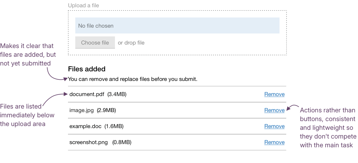
What’s shown back to users, file name, size, or type, should flex depending on the context. What matters most is consistency in the interface around it: where the list sits, and how key actions like Remove, Replace, or Delete appear and behave.
Preventing confusion and mistakes
Even when uploads appear to work, users can still be unsure what’s actually happened. They could assume a file has been submitted when it’s only been uploaded, or hesitate to remove or replace something in case they lose progress. These small moments of doubt create friction, slow people down, and can lead to missing or duplicated evidence.
Hypothesis: A clear distinction between uploaded and submitted states will help users upload the right files
Based on our understanding, users sometimes think that uploading a file means it has been submitted. We believe this is because interfaces don't clearly separate the temporary staging step from the final submission. So if we clearly signpost the difference between “uploaded” and “submitted”… We'll see more users finishing their submissions with all the files they intended.
From designers and researchers across DWP, we’ve heard about journeys where users interpret “Upload complete” as the end of the process. The distinction between uploading and submitting isn’t always clear.
Language, hierarchy, and visual grouping can help make this distinction clearer. For example, you could use a simple, consistent heading above the list of uploads, such as:
Files added
You can view, replace, or remove files before you submit.
This makes the state clear, keeps users oriented, and provides a natural cue for what to do next.
Hypothesis: Allowing users to delete or edit uploads will lead to more accurate submissions
Based on our understanding, users sometimes upload the wrong file by mistake, or want to make a change before submitting. We believe this is because people get interrupted, upload the wrong version, or realise something's missing. So if we provide simple edit and delete options… We'll see more users correcting mistakes quickly and more accurate submissions.
We’ve seen variation in how users can manage files once they’ve been added. Some services offer clear Remove or Replace actions, while others use different wording, such as Delete, or no option at all. The same action can also appear as a link in one service and a button in another.
The behaviour is broadly consistent, but the language and style are not; standardising both wording and visual treatment would help create a more predictable experience, especially for agents who regularly switch between services.
Could we improve this page?
Send questions, comments or suggestions to the DWP Design System team.
Last updated: