Design for mobile, edge cases and real-world use
Make uploads work smoothly for any device, connection or complexity
Not everyone uploads files from a high-spec laptop on a fast connection. Many people access DWP services on their phone, maybe while juggling other tasks, taking a photo of a document at the kitchen table, or trying to upload over patchy public Wi-Fi.
A DWP study in 2024 found that a smartphone was the device used most frequently by disability benefit customers to access the internet. At the same time, around a third of DWP customers said they’d reduced their mobile or internet use due to cost pressures, and 7% of UK households struggle to afford mobile services.
That means many people are completing critical tasks under real-world constraints: limited data, slow connections, low confidence, and older devices. Uploading a file might seem simple, but under these conditions, it can be stressful, slow, or even unaffordable. Designing only for the ideal setup – a fast connection, desktop layout, unlimited data – risks excluding the people who most need to access our services.
This design consideration is about making uploads work reliably wherever users are: on a phone with a patchy signal, a shared computer in a library, or a device with limited storage or permissions. That means designing for mobile by default, planning for interruptions, and testing in less-than-perfect conditions.
The challenge
Many services are accessed on mobile devices, sometimes with limited data or slower connections. Large or complex uploads, such as multiple files, high-resolution scans, or photos, can fail, take too long, or be difficult to manage. Without designs that adapt to mobile, minimise unnecessary data use, support interrupted uploads, and handle large volumes effectively, users can be left frustrated, blocked, or unable to complete their task.
What we’re exploring
Hypothesis: Designing for mobile by default will reduce failed uploads
Based on our understanding, many users upload files from their phones. We believe this is because mobile is often their primary or only way of accessing services. So if we design with mobile use as the default rather than the fallback… We'll see users able to complete their uploads with less friction and greater confidence in the process.
Designing for mobile first means more than shrinking a desktop layout; it means re-thinking the interaction around real mobile use.
That includes:
- Larger touch targets and simpler file selection (for camera, gallery, or files).
- Feedback that stays in view within the focused upload area.
- Support for pausing or resuming the upload when users lose connection, answer a call or switch apps
- Clear visibility of file size, progress, and next steps to help reduce uncertainty.
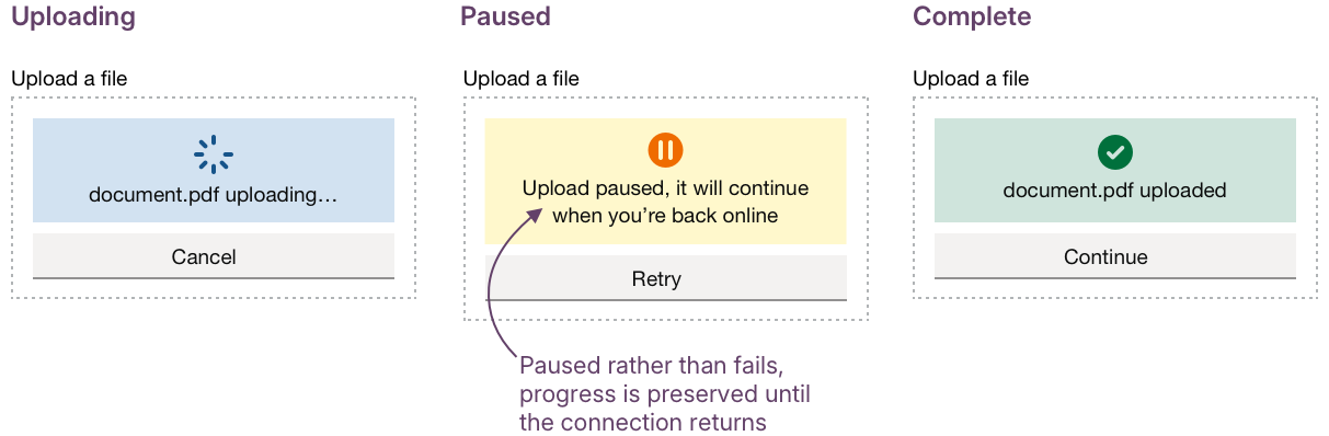
The following example shows how a compact upload component with states for uploading, paused, and complete, alongside clear, mobile-friendly actions like Retry or Continue later, could keep the interaction straightforward and recovery simple: no scrolling, no lost work.
Hypothesis: Designing for dropped connections will reduce failed uploads
Based on our understanding, slow or unstable connections can interrupt uploads. We believe this is because some services don’t allow users to resume where they left off. So if we detect dropouts and let users continue the upload without starting over… We'll see more users finishing uploads even after connection problems, without losing progress or restarting.
This matters most on mobile, where connections are more likely to fluctuate. Uploads shouldn’t fail silently or restart from zero. Instead, short, clear messages like “Upload paused, we’ll continue when you’re back online” can give reassurance without blame.
Persistent, inline progress indicators that pause and resume automatically once back online rather than resetting help protect effort and keep confidence high.
Hypothesis: Warning about large files will help people to complete uploads
Based on our understanding, mobile devices often create large image files by default. We believe this is because photos are captured at high resolution without compression. So if we give users clear information about file size and data usage before they upload, and offer the option to connect to Wi-Fi or continue… We'll see more users confidently complete uploads without frustration, wasted time, or unexpected costs.
Not everyone knows how big a photo file can be, or how much mobile data it might use. For many DWP users, data is precious; they’re often on pay-as-you-go plans or limited contracts, and uploading a large file could use up their allowance for the day. Giving that context before they press “upload” respects their time, money, and connection.
It also links to another practical issue: time. Large uploads don’t just cost data; they take longer, especially on slow networks. By surfacing file size and upload time early, we can help users make informed decisions rather than discovering problems halfway through.
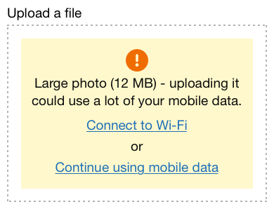
A simple prompt warning when a file is large would give users the information they need before they commit. It respects their data, time, and context. For example:
Large photo (12 MB) - uploading it could use a lot of your mobile data.
Connect to Wi-Fi or continue using mobile data.
Giving users visibility over their own upload journey, by showing what will happen before it happens so that they can act with confidence, reflects Service Manual principles such as “be clear and honest about what’s happening” and “do the hard work to make it simple.”
Hypothesis: Some use cases will need multiple uploads
Based on our understanding, some services require dozens of files to be uploaded. We believe this is because the task may involve multiple documents, images, or pieces of evidence collected over time. So if we add features like pagination, sorting, search, and batch review… We'll see more users able to manage their files easily, keep track of progress, and submit everything they need in one organised process.
As the number of uploads grows, the challenge shifts from simply adding files to managing them. The same principles we’ve seen in our filters work – clarity, visibility of state, and reducing cognitive load – apply here too.
Users need to see what’s complete, what’s still in progress, and what needs attention. Tools like search, sort, and batch review could help people stay organised and in control without adding extra steps.
Could we improve this page?
Send questions, comments or suggestions to the DWP Design System team.
Last updated: