Provide timely, clear feedback
Show users what’s happening, right where they’re looking, every step of the way
When someone uploads a file, they need to know what’s happening straight away and in the right place. Without timely, visible feedback, it’s easy to feel unsure or lose confidence.
Did the upload start? Has it finished? What happens next?
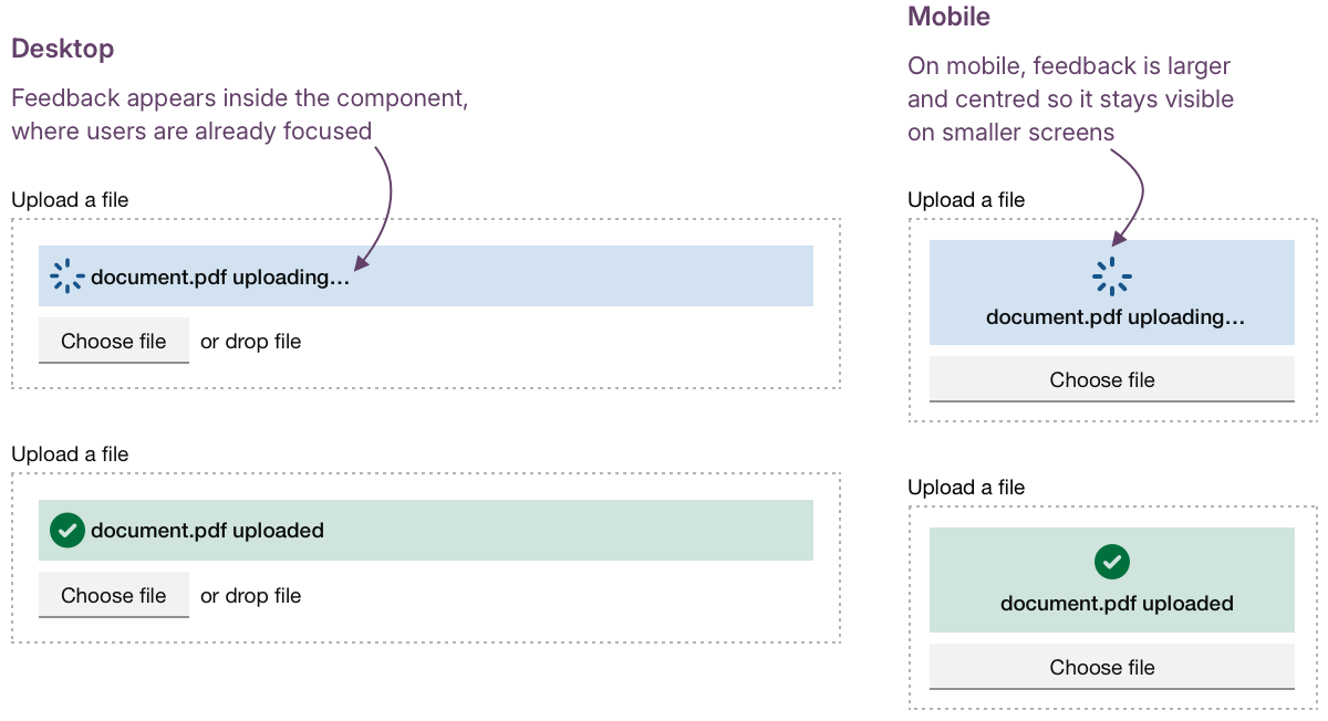
DWP services often need to ask for important or sensitive documents. Uploading these can be a stressful moment, especially for people who are unsure about formats, limits, or next steps. On mobile, smaller screens and patchy connections can make it harder to spot or trust what’s going on, especially if feedback appears away from where they are focussed.
Feedback only helps if users actually see it. This design consideration is about making feedback instant, visible and supportive at every stage of the process, from starting an upload, through to errors, confirmations and next steps.
The challenge
When upload feedback is delayed, unclear, or easy to miss, users can be left uncertain about what’s happening or what’s expected. This can lead to frustration, repeated uploads, or abandoned tasks, especially when files are important or sensitive. Poorly timed or inconsistent feedback undermines trust and makes an already stressful moment harder. On mobile, smaller screens and connection issues make clear, timely feedback even more critical.
What we’re exploring
While all the services we looked at provide some feedback, it is often not in the users’ line of sight. Many depend on notification banners or error summaries that may appear out of view, resulting in “banner blindness" and missed messages.
Feedback that’s too subtle, disappears too fast, or is too far from the upload control adds uncertainty, especially when users can’t easily retry without re-uploading.
Our research focuses on three areas:
- Making feedback instant and visible and where users interact
- Ensuring error messages are clear, supportive, and actionable
- Confirming success and next steps in plain, trustworthy language
Hypothesis: Instant, visible feedback will reduce repeated uploads and user error
Based on our understanding, users can lose confidence when feedback is delayed, disappears too quickly or appears away from the upload area. We believe this is because this is because they can’t see immediately whether an upload has started, finished, or failed. So if we provide visible, unmistakable feedback placed where users are already interacting… We'll see more users spotting and acting on feedback straight away, avoiding repeated uploads or missed messages.
Feedback should appear straight away and stay visible long enough to be read and understood. For longer uploads, small cues like progress indicators, animations, or a short “checking” state can reassure users that something’s happening and that the system is responding.
Feedback is sometimes shown in both a notification banner at the top of the page and in the uploaded file list. This duplication doesn’t always add clarity; instead, it means users have to look in multiple places for the same information.
In most cases, feedback isn’t shown within the component itself unless something goes wrong. "Helpful states like “uploading” or “success” often go unacknowledged, leaving users unsure whether anything has happened. On smaller screens, these messages can sit outside the user’s view, which, for anyone less confident with technology, can make the experience feel unresponsive even when it’s working as intended.
Experience from designers across government confirms that banners work well for confirming significant, page-level events, such as “Application submitted,” but are less effective for inline actions such as file uploads. When users’ attention is elsewhere, particularly on mobile, banners are easy to miss, which can lead to hesitation or uncertainty about whether the upload succeeded.
It might be more beneficial to place feedback directly within the component area, where it is more immediate, relevant, and actionable.
For example, the design could give instant feedback within the upload component itself by showing an inline spinner and success message in the same visual space, rather than in a separate banner or list. This keeps attention where the action happens and reduces the risk of missed updates. The goal isn’t to add more messages, but to make the ones we already show clearer and easier to act on.
Questions around how long feedback should remain visible, what triggers state changes, and how the component returns to its default state would all need to be explored through research and testing with users.
Hypothesis: Clear information about upload success and next steps will help people to move to the next step of their journey
Based on our understanding, users sometimes wonder if an upload finished successfully and what to do next. We believe this is because confirmations are not always prominent or immediate. So if we give clear, visible confirmation messages and explain the next step… We'll see more users moving smoothly into the next step of their journey, without hesitation or second guessing.
Success feedback should do more than confirm that an upload worked; it should help users understand what’s happened and what they can do next. Across services, we’ve seen this vary a lot. Some show a fleeting message like “File uploaded,” while others rely on the file simply appearing in the list below.
Short, plain confirmations such as “File uploaded successfully” work best when paired with a clear next step, for example, “You can now add another file or continue.” But it’s also about exploring the placement of the message; would this work better if it appeared within the component itself, right where the user's attention is focused?
For multiple uploads, this becomes even more important. Showing progress such as “3 of 5 files uploaded,” alongside clear next steps like “You can upload 2 more files or continue,” helps users keep track of where they are and what to do next.
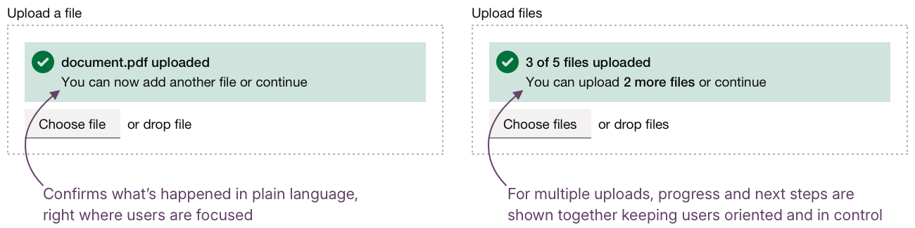
This follows the same principles we discuss in Designing data interfaces: giving people visibility over what’s complete, what’s in progress, and what comes next.
Could we improve this page?
Send questions, comments or suggestions to the DWP Design System team.
Last updated: