Turning data into information: a practical example
What does it look like to work through this design process in a realistic situation? Let’s imagine a design challenge for an imaginary staff-facing application showing customer data.
Scenario
When people call DWP for information, they often want to know when and how much their next benefit payment will be.
In our imagined scenario, user research has observed staff navigating around the customer information system to find payments data so they can answer this basic question. Agents have also been seen manually adding up different awards from individual benefits to tell customers the total, and looking up payment dates from yet another page in the system.
Although (in our scenario) there is a policy that changes cannot be made to payment dates within 5 days of the next payment, this is not enforced by the system. Records show that payment dates are sometimes mistakenly changed within the 5-day period, causing errors and delays in payment.
Design challenge
- How can we surface the basic information agents need without them having to navigate to find it or do any manual calculations to relay the information to the customer?
- How can we prevent payment dates being changed within 5 days of the next payment?
- How can we help agents understand the cut-off period for changes so they can give better information to claimants?
The following data is available in the back-end system:
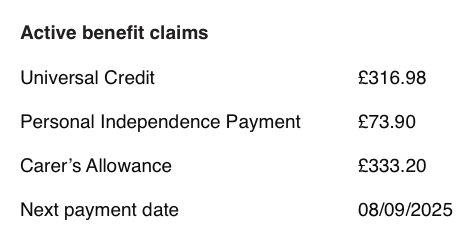
Customer record
| Field | Value | Amount |
|---|---|---|
| First name | Danielazamorano | |
| Surname | Berdichevskiy | |
| National Insurance number | QQ 12 34 56 C | |
| Active benefit claims | Universal Credit | 316.98 |
| Personal Independence Payment | 73.90 | |
| Carer's Allowance | 83.30 | |
| Next payment date | 08-09-2025 |
Policy data
| Field | Value |
|---|---|
| Record update cut-off (days) | 5 |
Evolving the design from data to information
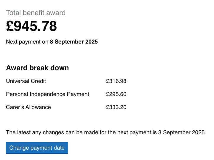
1. Display basic payment information on the record’s landing page
The first step might be to decide what information is likely to be most important and display that on the landing page. A hypothesis for this design change might be:
Hypothesis
Based on our understanding, agents are navigating around the system to find basic payment information. We believe this is because the payments are only displayed in one place in the system and presented in a table. So if we show basic payment information about the next payment on the record's landing page… We'll see agents being able to answer the most common queries about payments without navigating beyond the record's landing page.
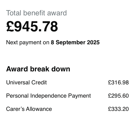
At its most basic this page might look like this: a simple table showing all active benefit claims, the amount of each and the next payment date.
We can already see some ways to improve this basic presentation:
Sum the individual payments to give a total and present the whole figure first as this is the most common query
Reformat date and give the date context to be more conversational making it easier for agents to communicate to customers in natural language that customers understand
Surface underlying data if useful: in this case showing the breakdown of payments helps communicate how the total has been calculated
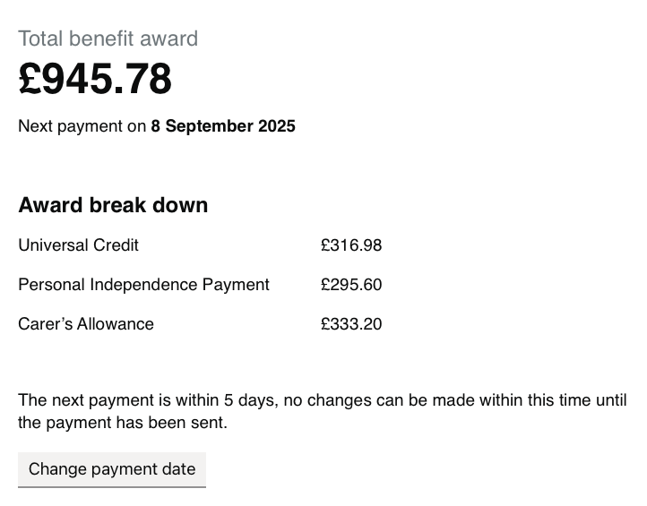
2. Prevent changes being made during cut-off period
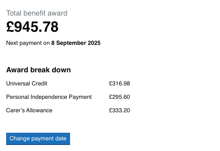
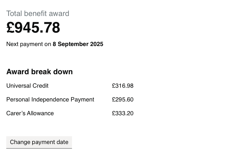
To make the data actionable we can add elements to the design based on what agents might want to do next. For example, in our scenario we might add a “Change payment date” button.
Because we know there are limits on when an agent should be able to do this action, we can use our Policy data combined with the current date and the payment due date to automatically disable this button during the cut-off period. In our basic wireframe this might look like having a button that is greyed out when not available.
Hypothesis
Based on our understanding, agents need the ability to change payment dates; but this is sometimes done within 5 days of the payment due date, which can cause errors and delays. We believe this is because the option to change a payment date is always available. So if we disable the option to change payment dates during the 5-day period… We'll see a reduction in payment errors and a more consistent execution of policy regarding changing payment dates.
3. Help agents understand the underlying process
Having a button that changes apparently without warning is likely to be a bad experience. If we show agents some supporting information about why payments can't be changed, we may also help them to understand and remember the policy so that they can explain it to claimants.
Hypothesis
Based on our understanding, agents don't know why the cut-off period exists so can't explain it to customers. We believe this is because agents may forget the current policy, or may be new or inexperienced. So if we display some information to remind agents why the date can't be changed… We'll see agents understand why the option to change dates is disabled and be able to pass this information on to customers.
A note on presenting numbers clearly
Data interfaces often need to represent numbers, for example to show financial or date information. There are a few things you can do to present numbers clearly and accessibly:
- use comma separators for numbers of four digits or more; 120,873 is easier to read than 120873
- right-aligning numbers in table columns makes it easier to compare them because the units, tens and hundreds digits (and so on) are in the same position in each row
- avoid using decimals if you can
If the values to be compared include numbers both with and without decimals, the best treatment is to align them at the decimal point rather than to the right. In practice it is usually enough to make sure all numbers either do or do not have decimals.
Presenting numbers clearly is particularly important for people with dyscalculia. Learn more about what this means for your design choices in this post from the Design in Government blog.
Testing with users
We now have something we can test with users. It’s particularly important to record before testing what you expect to see if you’re right (or wrong). Based on our design hypotheses we would ask:
- Can agents answer the most common query without navigating away from the initial screen?
- Has there been a reduction in payment errors and a more consistent execution of policy regarding changing payment dates?
- Are agents better able to understand the cut-off dates for payment changes, and to explain this to customers?
Depending on what we learn, we might iterate the design further or discover other hypotheses to test.
Could we improve this page?
Send questions, comments or suggestions to the DWP Design System team.
Last updated: