User research
This pattern is based on the HMRC 'Add to a list' pattern but we recommend using a secondary button instead of radios to add new items. This follows research from HMRC in 2019 which found usability issues with radios.
Follow this pattern instead of cloning fields on the same screen and then adding all items at once. Research on this approach at Ministry of Justice found that it could cause performance and validation problems; it also makes it more difficult for users to fix validation errors as they go.
Dynamically updating headings on nested question screens
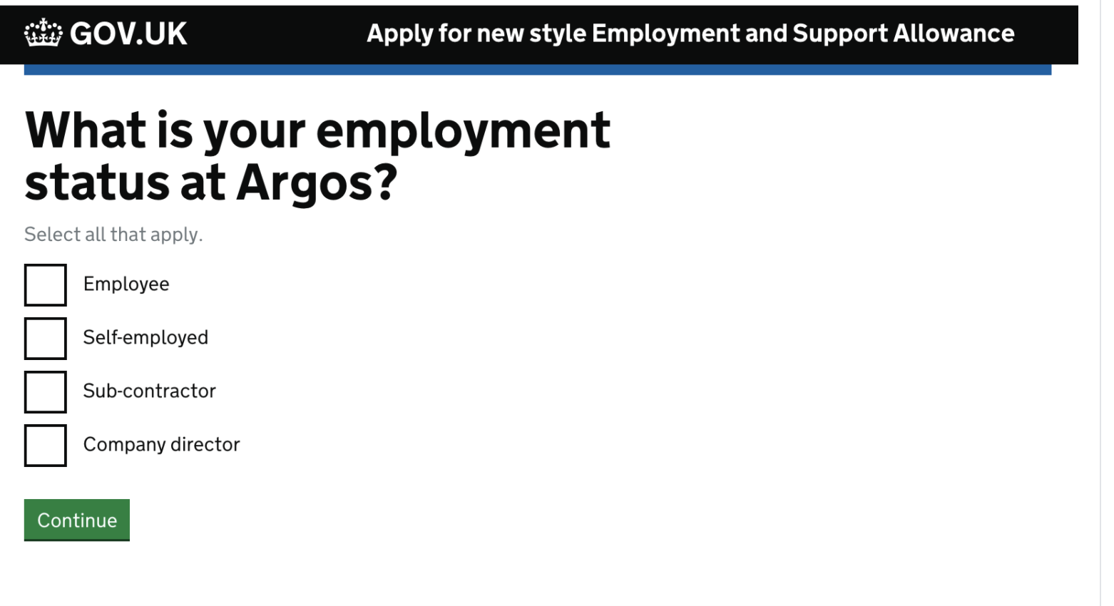
The Apply for New Style Employment and Support Allowance service found that users could keep track of what they were doing more easily if the headings updated to show which item was being worked on.
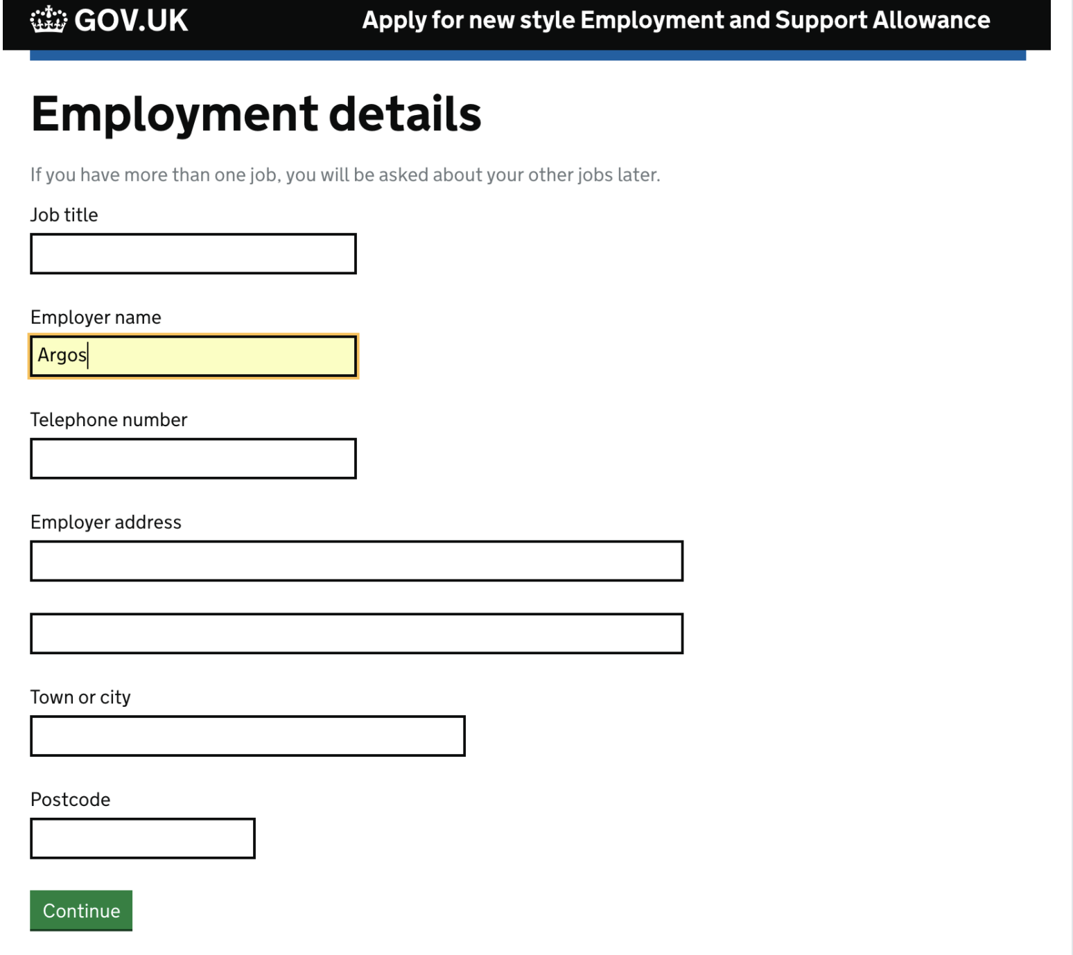
In this prototype, once the user had given the employer name following questions included this information: "What is your employment status at [NAME]?"
Using the pattern to replace a radio option
The Add another thing pattern is used in the My Child Maintenance Case service. In one part of the service users were asked to confirm that a list of items was correct: this was done by a yes/no question followed by a Continue button. If the user answered "No" then the Continue button launched a flow which added or removed items from the list.
User research found that some people did not understand the screen. They quickly clicked "Continue" without being aware that they were making a choice, and were then confused to be asked further questions about which items needed changing. The design team replaced this interaction with the Add another thing pattern, so that the list of items was editable and an "Add another payment" link was available.
Subsequent research found that this solved the problem for most users and they correctly selected "Continue" or "Add another payment" depending on what they wanted to do. This observation was supported in production by metrics and analytics on the live service.
Text link or secondary button?
The same service used a text link for the "Add another item" link instead of the standard secondary button. This was because the secondary button was being interpreted as page navigation like the Continue button, rather than being associated with modifying the list of items (which also uses text links for the Change function on each item).
There was limited direct comparison of the two options, but all users were able to find and use the text link without problems.
Get support
Need help implementing this in a prototype or production build? Get support from the Design System team.
Give feedback
We depend on insights from real projects to update and improve the design system. If you use something we made, tell us how it went.
Could we improve this page?
Send questions, comments or suggestions to the DWP Design System team.
Last updated: