Designing a filter component
When designing a screen that includes filters you have several decisions to make:
- layout: where to place the filter controls
- inputs: how to style the controls (checkboxes, radios?)
- behaviour: whether to filter results all at once (batch filtering) or as filters are added and removed (live filtering)
- state: how to represent the various states of the system (filtered, unfiltered and so on)
Layout choices
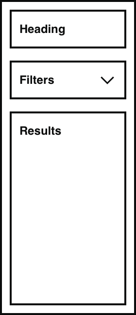
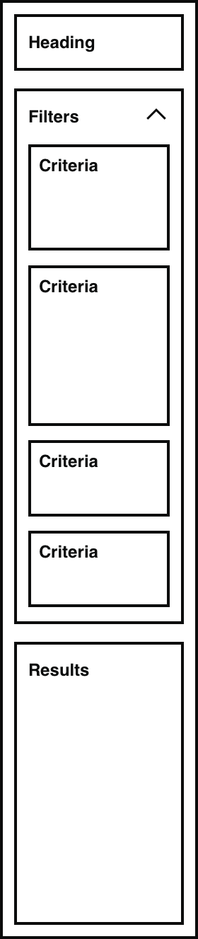
Where to put filter controls
On a desktop viewport, users generally expect to find filter controls in a left hand column with the list of results to the right.
We have seen desktop examples of filters taking position in a left column or above the results. Most examples have shown filters to the left column. Examples where filters have been shown above the results don’t scale well, and the organisation of the content within the filter becomes less easy to follow as the width of the screen is used to create multiple columns of filters.
It has been noted that on mobile and tablet views filters would inevitably sit above the results and the results would be most likely end up being out of view. We have not seen many examples of filters designed to sit above the content in desktop views.
An internal service tested filters in the right column to determine any preference or performance difference. They found that all users asked (including screen reader users) preferred the filters in the left column.
Showing and hiding filters
Some implementations included Show and Hide buttons for the filter controls. This was common when it was important to maximise screen area for results: for example when filtering a table.
Mobile views
On narrower viewports such as mobile, the normal behaviour is for filters to appear above the results list, even if they are shown to one side on wider views. This creates an issue where filters push the results (the most important information) down the screen and out of view.
Inputs
The most common filter controls are checkboxes and radios, but you can also build a filter using other controls:
- text input of keywords
- multiple text inputs to define a range (of prices or dates, for example)
- sliders
- clickable tags or labels
- dropdown menus (be careful of accessibility and usability)
Choosing which component to use as a filter control depends on understanding both the data you are working with and the user’s context. Considerations include:
- data type – number, status, date
- format – predefined value, whole number, decimal, date format
- how much precision the user needs at this stage of their journey
- the task the user is performing
- the environment – mobile, desktop
As a starting point, review how the data was originally entered into the system. For example, in an agent-facing system, if the value for status is set using radio buttons, start by using radio buttons for the filter.
This does not work in all situations. For example, financial data might be entered into a system as a specific value (“Weekly income”). For a filter querying this data, it might be better to use radios for various ranges like “£1–£100” as the user is unlikely to know the exact value when searching.
Checkboxes
Checkboxes allow users to select multiple values for a filter. They can be used to include more than one value. They generally enable broader searches and can support all search behaviours.
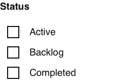
The way checkboxes work depends on the underlying data. If values are mutually exclusive then leaving a box unchecked has the effect of excluding those records.
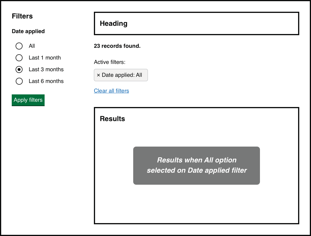
In the example below, an item can only have one ‘Status'. The filter would return all records whose status is Active OR Backlog, but exclude those whose status is Completed.
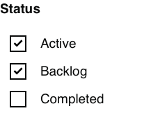
On initial load none of the checkboxes are selected: all results are shown because there is no ‘Status’ filter applied. Note that this has the same effect as selecting all the checkboxes: in this case a ‘Status’ filter is applied but all criteria are included. This behaviour is standard when reviewing the use of checkboxes in filters on other services and we believe it is well understood and expected by users.
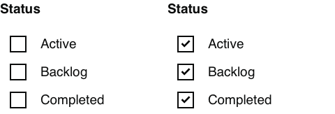
In this example, checking all boxes and checking none have the same effect of returning all items.
Radio buttons
Radio buttons are useful to ensure users only pick one option out of a list. When a radio button is selected there is no way to unselect it: the only option is to choose another button in the list.
This is an issue if the user no longer wants any of the radios selected (they want to clear the filter). So there needs to be a way of clearing filters when using radio buttons.
Two potential approaches are:
- An additional radio showing an "Any/all" option
- A separate link or button to clear all radios
All/any option
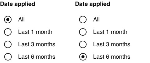
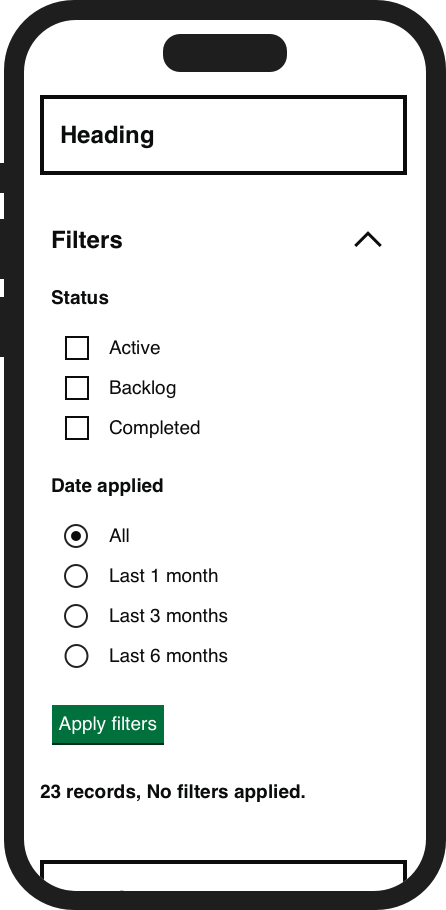
This approach adds an “All” option to the list. This option is selected by default and enables users to choose this option to remove the filter. Even though selected, normal behaviour is for this not to be considered as an applied filter: selecting this option is equivalent to clearing the filter.
With a radio filter selected, the user can clear it by either selecting ‘Clear all filters’ or changing the selected radio to ‘All’.
Clear button
The other approach is to include a button or link which clears the selected radio option within that particular filter heading. For non-Javascript users, a server-side solution would be required to reload the page with the radio button deselected, and the rest of the selected filters and a view of the results would need to remain unchanged.
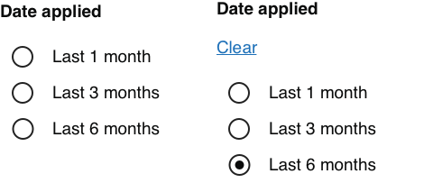
This option may cause confusion if there is also a button labelled “Clear all filters”. Our recommendation is to use the “All” approach when building filters with radios.
Behaviour
Batch filtering or live filtering?
With batch filtering, filters are not applied until the user takes a deliberate action such as clicking an Update button. The results list remains unchanged as the user adds and removes filters and then updates when the user is ready to apply them.
With live filtering, the results list updates automatically as each filter is set. This means the results appear to be instant (depending on performance) and filters and results are always synchronised.
Based on our research we believe batch filtering is preferable to live filtering.
Points to note about batch filtering:
- during the process of selecting filters the results shown are not reflective of the options selected until the user applies the filter – so the views are not synchronised
- the user has to remember to apply the filters
Points to note about live filtering:
- unintentional clicks lead to changing the results and any filter related messaging/content
- can be frustrating if multiple filters are applied as results will refresh as each option is selected
- when results are visible (for example on desktop view), applying multiple filters can be distracting and affect the cognitive process as results change on every selection
- when the results are not visible (for example on mobile) the action of filtering being applied is not prominent
- when used at scale there is a performance cost to making multiple requests in quick succession
State
Filters don’t exist on their own. The filters although optional, should not be isolated – they are connected to the results even when no filters have been applied. We believe there needs to be some way of displaying how filters have influenced the results: the state of the currently displayed results. The job of the state is to bridge the gap between the filters component and the results.
The relationship between filters, state and results
Hypothesis: filter state should be shown near results
Based on our understanding, users need to understand the state of the results list without looking at the filter component. We believe this is because users may miss the filter component, the component may be out of view, or users may not be expecting it to give them information about the results list.So if we also show the filtered state near the results list...We'll see users understand the state of the results list before and after filters are applied.
In a batch filtering approach, there are times when the filters and the results are not synchronised: for example, when filters have been selected but not applied. (This is less of a problem with live filtering, though even then there are delays while results load or the page checks for updates.) We believe people should be able to see at a glance:
- which filters have been applied, if any
- what effect this has on the results
- how to reset any active filters
Anatomy of filter state
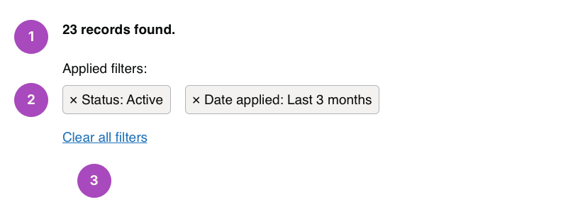
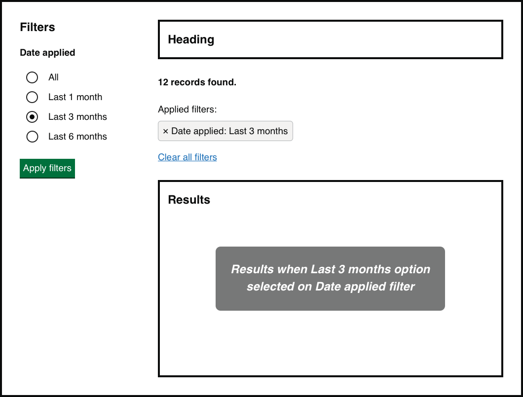
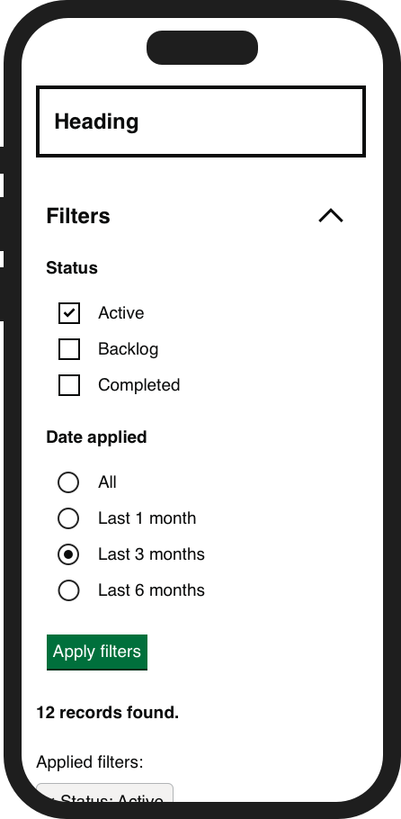
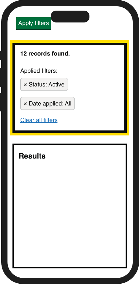
Result count: always displayed and communicates if filters have been applied and how many results have been found.
Applied filters: displayed only when filters have been applied. Each applied filter is a button consisting of the filter category and the value of the applied filter. The button performs two functions:
- communicates which filter has been applied
- removes the filter, which is shown by the × symbol
Clear all filters: a link or button to remove all applied filters.
Making state explicit
On smaller viewports such as mobile, the filter control itself may not always be visible, because the list of results is more important and screen space is limited. This could be by design (the control disappears once applied) or by accident (scrolling naturally hides the control).
We believe that the best filter designs make the state clear even when the control itself is invisible, because this removes ambiguity about whether results are filtered or not. This could be by showing labels of the filters that have been applied.
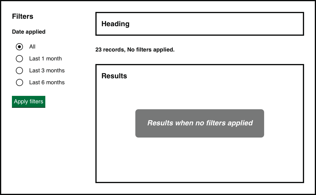
There are three main states you will need to design for: no filters applied, no results found, and results found.
No filters
The default state of the view, when no filters have been applied. When all filters are removed the state returns to this default.

No results
When filters have been applied but there are no results: the filters have filtered out all records. The user can remove filters to loosen the criteria for their search.

Results found
Communicates how many results match the filter criteria. The state shows how many results have been found as well as the filters applied. The user can decide to add filters to narrow results further or remove them to widen their search.
Synchronisation
When a user has selected filters but not yet applied them, the filters, state and results will not be synchronised. Even with a live filter mechanism there will be some delay in the page loading after a filter has been applied.
In these situations the state and results do not match what has been set in the filters component. For this reason we think a good design will not rely on the state of the filter component itself (for example, checkbox selected or cleared) but will also communicate state elsewhere on the screen.
This also helps users to interpret the state when filter controls are hidden, for example on mobile views or when the controls have scrolled off the screen.
Example: filters without state
In the absence of state, users have no context for the results. If the user looks at the filter component for context, it is providing the wrong information until the filter has been applied and loaded.
Example: filters with state
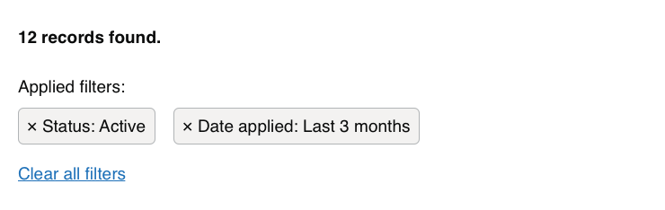
On this screen the state and results are not synchronised with the filters, but this is clear because the "Active filters" state marker doesn't match the filter component.
Feedback that filters have been applied
In some situations it is not clear from the results alone that filters have been applied: for example, if the visible results on screen are the same after filtering. One solution is to give focus to the state at this point, summarising the results of the filter.
Example: no focus on state after filtering
Highlighting the change when filters are applied is more important when the filters and the results may not all be in view. In the examples below, it is not easy to notice that the filters and state have been updated.
Example: focus on state after filtering
The following example shows the state when given focus after the filter has been applied. The user may not see the results in view, or the results in view may not appear to change. However, the state shows a clear change and summarises what has happened after the filter has been applied.
Response delay and progress indicators
If updating results is either very fast or very slow, it may appear to users as if nothing is happening and they may need extra visual clues.
If the system is too fast, you could consider introducing an artificial “response delay” where the system appears to take longer than it does. This may be a matter of less than a second, but it can help users to understand that the system has done some work. Research on response delay:
- Response Time and Display Rate in Human Performance with Computers (Shneiderman, 1984)
- Response Delay on ScienceDirect.com
If the system is slow, you can show a progress indicator to communicate “filtering is happening” and “filtering is complete”. Depending on how long the delay is there are many options for the design of a progress indicator, ranging in complexity from a simple animated “something is happening” image to estimates of remaining time or percentage of work.
Could we improve this page?
Send questions, comments or suggestions to the DWP Design System team.
Last updated: