Make uploads discoverable and understandable
Help users spot and understand the main upload action so it's clear, accessible, and easy to start
In many DWP services, uploading a file is the key task at that point in the journey. But the upload action itself isn’t always easy to spot or understand. Users might know exactly what they need to do, but still hesitate because they can’t see how to do it.
For agents under pressure, that hesitation adds friction to a task that should be quick and straightforward. For citizens, it can add anxiety or delay.
The challenge
Users don’t always struggle with what they’re being asked to do; sometimes they struggle to see how to do it. When the upload action isn’t visible or feels uncertain, users hesitate, miss it, or resort to trial and error. For agents under pressure, this slows them down and breaks their flow.
What we're exploring
We’ve seen upload buttons styled as secondary actions, often in grey, which can be hard to notice against the background, especially on older monitors or for users with limited vision. Drop zones add another challenge: they’re sometimes unclear, or only appear once a file is dragged over, leaving users guessing. And when drag-and-drop is treated as the main route, it risks excluding those who aren’t confident with it.
That’s why the hypotheses here focus on two things:
Making the main upload action more visible and distinct
Ensuring drag-and-drop supports users rather than blocking them; looking at how alternative upload routes can add flexibility without excluding people who don’t use or recognise that behaviour
Making the main upload action more visible and distinct
Hypothesis: Using a secondary action button for the upload action leads to it being overlooked
Based on our understanding, users can hesitate or miss the upload action when the button is not visually prominent. We believe this is because secondary button styling or lower page placement makes the action less noticeable. So if we make the upload button more visually prominent, even when it appears later in the page layout… We'll see more users spotting and starting their upload straight away, with fewer delays or missed actions.
There’s some evidence from other government services grey secondary buttons in upload journeys can be missed by users. They can look inactive and blend into the background, or appear disabled even when they aren’t.
We’ve put together a few examples to show what’s possible. The key question is whether a new style genuinely improves clarity, or if issues with secondary buttons only arise in specific contexts.
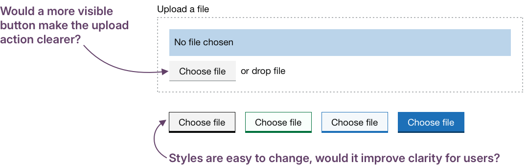
When upload is a key action, it needs to look like one. Secondary-style buttons can blend in or look inactive, especially on older monitors. Testing bolder styles would help us determine if small visual changes can make significant differences in clarity.
Ensuring drag-and-drop supports, not blocks
Hypothesis: Offering drag-and-drop as a supporting interaction will allow more users to complete the journey
Based on our understanding, some users prefer drag-and-drop because it feels faster or more natural.We believe this is because it mirrors real-world behaviours and can reduce navigation through file dialogues. So if we offer drag-and-drop alongside standard upload controls… We'll see more users choosing the method that works best for them, staying in control and progressing smoothly.
Hypothesis: If drag-and-drop is visually dominant users may not notice other upload methods
Based on our understanding, some users assume drag-and-drop is the only way to upload when it’s visually dominant. We believe this is because the upload button is not given equal visual weight. So if we visually balance both options and signpost that files can be selected or dragged… We'll see more users starting their upload with confidence regardless of their preferred method or device without slowing the process.
One option might be to iterate the current GOV.UK component to test both these ideas. Instead of leaving “or drop file” as a small add-on, this alternate version introduces a heading that makes the choice explicit, makes the button more visible, and defines a clear drop zone.
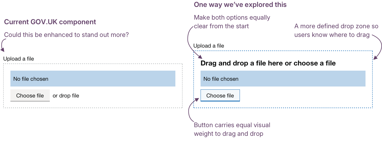
These changes might make drag-and-drop both obvious and optional, but we need research to see if they actually reduce hesitation and help users act with confidence.
Clarify where to drag
A clear, visible drop zone helps users act with confidence. Even before they start dragging, they can see where the action will happen and what to expect. Strong visual cues reduce hesitation and remove the need for guesswork.
Hypothesis: Clarify where to drag files
Based on our understanding, users can hesitate or make errors when drop zones are unclear or appear only during dragging. We believe this is because they can’t easily identify where the files should be dropped. So if we make the drop area visible by default or highlight it during a drag action… We'll see more users completing drag-and-drop successfully, without trial and error.
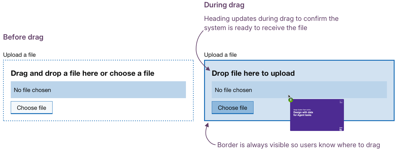
The example layout below shows a drop zone that clarifies where files should be placed. The border is always visible, giving users a clear target area. When a file is dragged over, the outline and background change to confirm they’re in the right place.
The text also updates in real time, changing to “Drop file here to upload”, reinforcing the shift from static to dynamic feedback. Changing the appearance during drag confirms that the system is responding, giving users confidence that their action is being recognised.
Progressive enhancement for mobile
Making the drop zone clearer helps people on desktop, where dragging is most common. But on mobile, that same pattern can become a barrier. Touch interactions don’t always map neatly to dragging, and large empty drop zones can make layouts feel broken or confusing.
Treating drag-and-drop as an enhancement rather than a dependency avoids these issues and keeps the experience consistent across devices.
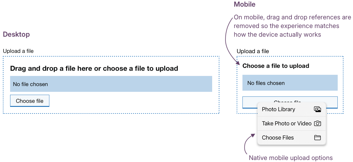
The Choose files button should remain the constant, visible route for everyone.
On mobile, that same button opens native options: Photo Library, Take Photo or Video, or Choose Files, keeping the experience simple, familiar, and accessible.
Hypothesis: Drag-and-drop should not be the default option on mobile devices
Based on our understanding, drag-and-drop can cause layout or interaction issues on mobile devices. We believe this is because it’s mainly a desktop-first pattern that doesn’t adapt to touch. So if we treat drag-and-drop as a progressive enhancement and optimise it for desktop while keeping mobile unaffected… We'll see more consistent, accessible experiences across devices with no one excluded.
The example below shows how a component might adapt across devices. On desktop, drag-and-drop enhances the experience. On mobile, it’s replaced by native upload options that keep the interaction clear and accessible.
Could we improve this page?
Send questions, comments or suggestions to the DWP Design System team.
Last updated: